
PL-300 Power BI Practice Questions Part 2 | Visuals & Data (Q26-50)
Continue mastering the PL-300 exam with practice questions 26-50. This set dives deeper into Power BI visual interactions, data formatting, anomaly detection, and advanced analytics features.
Question 26:
You have a Power BI report that contains a page. The page contains the following:
– A shape named Shape1
– A card named Sales Summary
– A clustered bar chart named Sales by Region
You need to ensure that Sales Summary renders on top of Shape1. What should you modify?
- A. Tab order in the Selection pane
- B. Layer order in the Selection pane
- C. Maintain layer order in the General visual settings
- D. Vertical alignment in the Canvas settings
Question 27:
You have a Power BI report named Report1 and a dashboard named Dashboard1. Report1 contains a line chart named Sales by month. You pin the Sales by month visual to Dashboard1. In Report1, you change the Sales by month visual to a bar chart. You need to ensure that the bar chart displays on Dashboard1. What should you do?
- A. Refresh the dataset used by Report1 and Dashboard1.
- B. Pin the Sales by month bar chart to Dashboard1.
- C. Select Refresh visuals for Dashboard1.
- D. Edit the details for the dashboard tile of Dashboard1.
Question 28:
You have the visual shown in the exhibit. You need to show the relationship between Total Cost and Total Sales over time. What should you do?
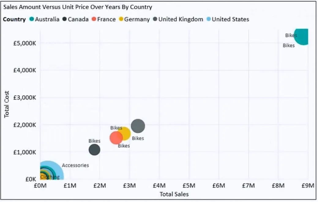
- A. Add a play axis.
- B. From the Analytics pane, add an Average line.
- C. Add a slicer for the year.
- D. Create a DAX measure that calculates year-over-year growth.
Question 29:
HOTSPOT – You need to create a Power BI report. The first page of the report must contain the following two views:
– Sales By Postal Code
– Sales by Month
Both views must display a slicer to select a value for a field named Chain. The Sales By Postal Code view must display a map visual as shown in the following exhibit. The Sales By Month view must display a column chart visual as shown in the following exhibit. Users must be able to switch between the views by using buttons on the report page. The selected Chain field must be maintained when switching between views.
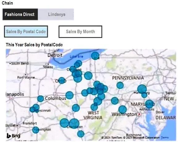
What is the minimum number of bookmarks required, and which property should you apply to each bookmark? To answer, select the appropriate options in the answer area.
- Minimum number of bookmarks required: [Option]
- Property to apply: [Option]
Question 30:
You have a collection of reports for the HR department of your company. You need to create a visualization for the HR department that shows historical employee counts and predicts trends during the next six months. Which type of visualization should you use?
- A. ribbon chart
- B. scatter chart
- C. line chart
- D. key influencers
Question 31:
Your company has employees in 10 states. The company recently decided to associate each state to one of the following three regions: East, West, and North. You have a data model that contains employee information by state. The model does NOT include region information. You have a report that shows the employees by state. You need to view the employees by region as quickly as possible. What should you do?
- A. Create a new aggregation that summarizes by state.
- B. Create a new aggregation that summarizes by employee.
- C. Create a new group on the state column and set the Group type to List.
- D. Create a new group on the state column and set the Group type to Bin.
Question 32:
You need to create a visual that enables the adhoc exploration of data as shown in the following exhibit.
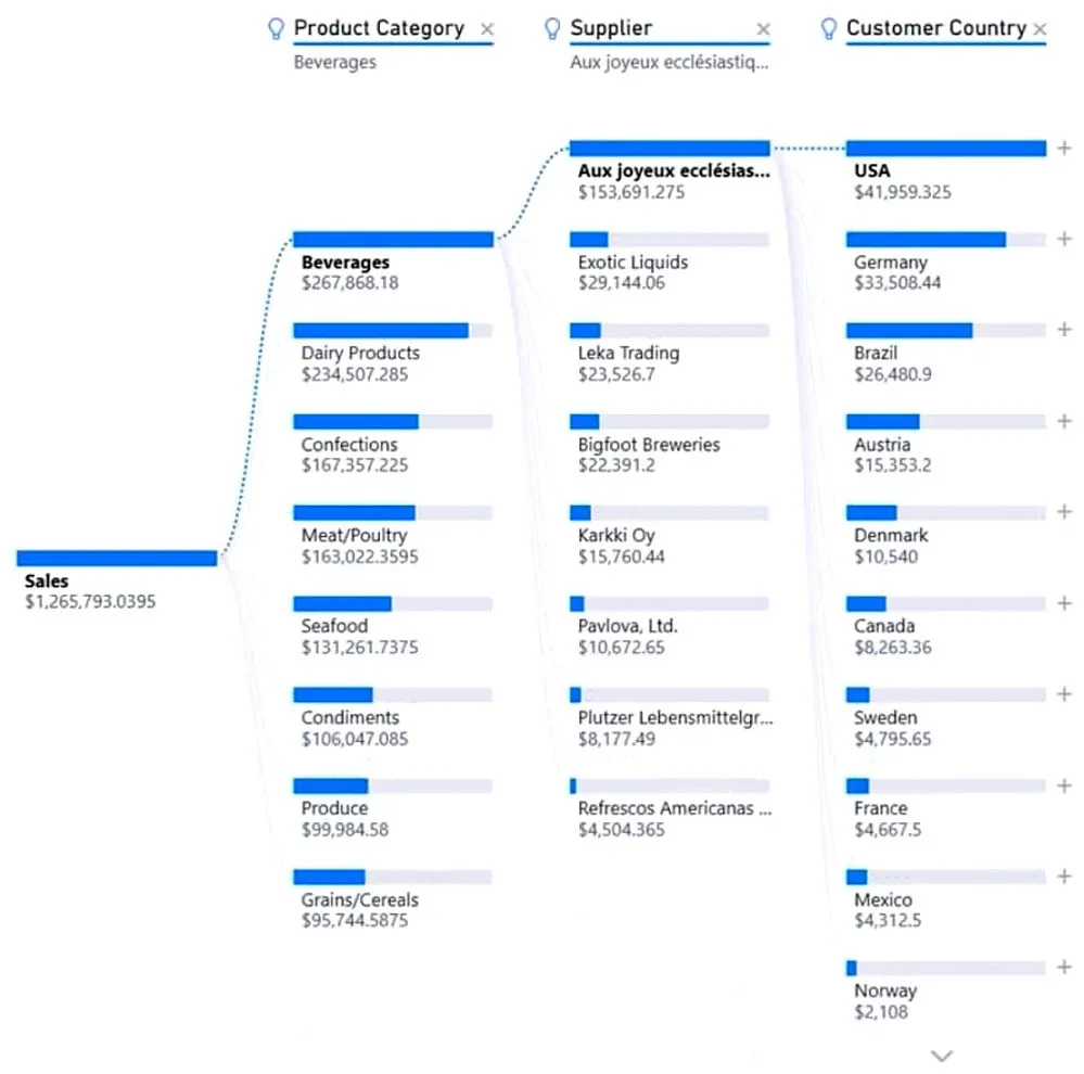
- A. smart narrative
- B. decomposition tree
- C. Q&A
- D. key influencers
Question 33:
You have the visual shown in the Original exhibit. You need to configure the visual as shown in the Modified exhibit.
What should you add to the visual?
- A. a measure
- B. an Average line
- C. a trendline
- D. a forecast
Question 34:
HOTSPOT – You have a dataset named Pens that contains the following columns:
– Item
– Unit Price
– Quantity Ordered
You need to create a visualization that shows the relationship between Unit Price and Quantity Ordered. The solution must highlight orders that have a similar unit price and ordered quantity. Which type of visualization and which feature should you use? To answer, select the appropriate options in the answer area.
- Visualization type: [Option]
- Feature: [Option]
Question 35:
You have a Power BI workspace named Inventory that contains a dataset, a report, and a dashboard. You need to add an additional tile to the dashboard. The tile must show inventory by location. This information is NOT visualized in the report. The solution must minimize the impact on the report. Which two actions should you perform?
- A. Ask a question by using Q&A.
- B. Hide the report page.
- C. Pin the visual to the dashboard.
- D. Use quick insights on the dashboard.
- E. Add the visual to the report.
Question 36:
You have a Power BI report. You have a table named Data1 that contains 10 million rows. Data1 is used in several visuals, including a scatter plot. You need to modify the scatter plot to make it easier for users to identify meaningful patterns. The solution must not affect the accuracy of the other visuals. What should you do?
- A. Add a count field of the transaction amount to the size bucket of the scatter plot.
- B. Add a trend line to the scatter plot.
- C. Enable high-density sampling on the scatter plot.
- D. Apply a row filter to the Data1 query in Power Query Editor.
Question 37:
You maintain a Power BI workspace that contains a supplier quality dashboard. The dashboard mobile layout is shown in the exhibit. You need to modify the dashboard mobile layout to meet the following requirements:
– Only show single-value visuals.
– Minimize scrolling.
What should you do?
- A. Decrease the size of the card visuals. Remove the map and bar chart visuals.
- B. Decrease the size of the map and bar chart visuals. Move all the card visuals to the top of the layout.
- C. Remove the card visuals. Increase the size of the map and bar chart visuals.
- D. Move the bar chart visuals to the top of the layout. Remove the map visuals. Decrease the size of the card visuals.
Question 38:
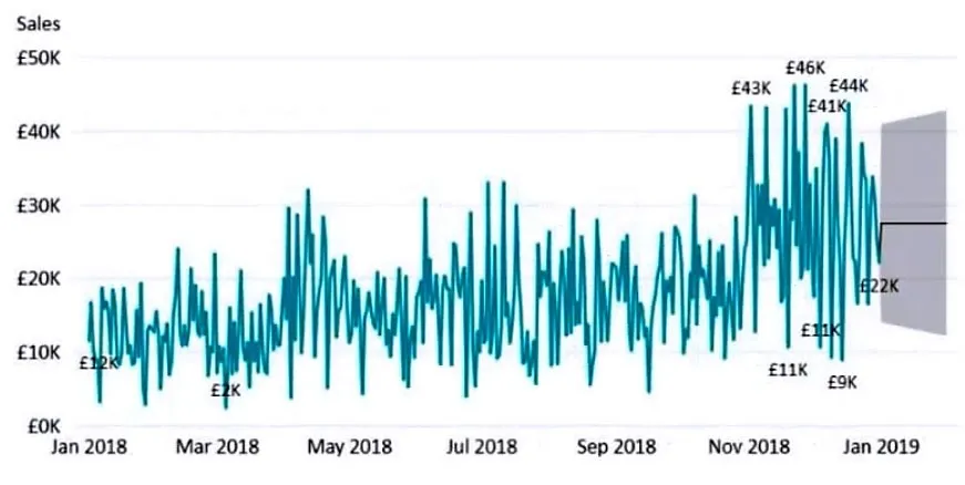
You have a Power BI report. The report contains a visual that shows gross sales by date. The visual has anomaly detection enabled. No anomalies are detected. You need to increase the likelihood that anomaly detection will identify anomalies in the report. What should you do?
- A. Increase the Expected range transparency setting.
- B. Add a data field to the Legend field well.
- C. Increase the Sensitivity setting.
- D. Add a data field to the Secondary values field well.
Question 39:
You have a dashboard that contains tiles pinned from a single report as shown in the Original Dashboard exhibit. You need to modify the dashboard to appear as shown in the Modified Dashboard exhibit.
What should you do?
- A. Change the report theme.
- B. Change the dashboard theme.
- C. Edit the details of each tile.
- D. Create a custom CSS file.
Question 40:
You are creating a Power BI report to analyze consumer purchasing patterns from a table named Transactions. The Transactions table contains a numeric field named Spend. You need to include a visual that identifies which fields have the greatest impact on Spend. Which type of visual should you use?
- A. Q&A
- B. smart narrative
- C. decomposition tree
- D. key influencers
Question 41:
HOTSPOT – You have a Power BI visual that uses indicators to show values that are out of range as shown in the following exhibit.
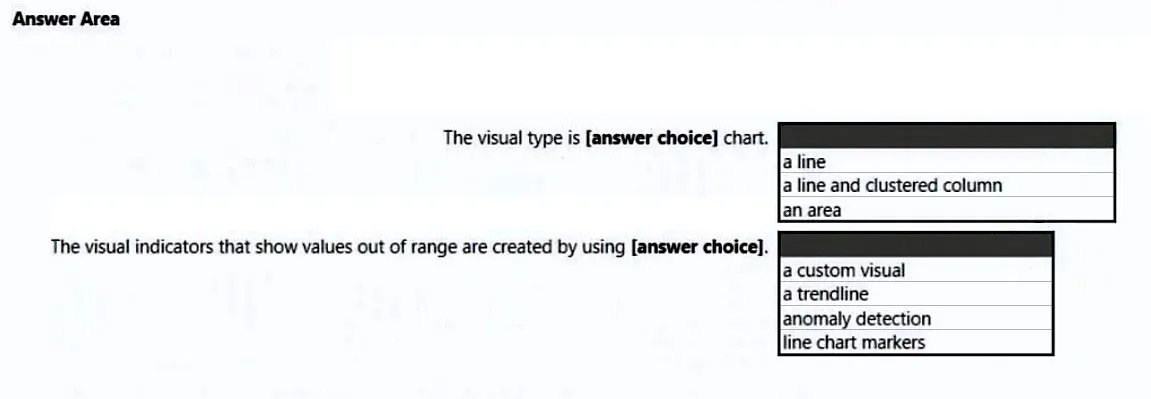
Use the drop-down menus to select the answer choice that completes each statement based on the information presented in the graphic.
- The visual is a: [Option]
- The out-of-range value is shown as an: [Option]
Question 42:
You have a report that contains three pages. One of the pages contains a KPI visualization. You need to filter all the visualizations in the report except for the KPI visualization. Which two actions should you perform?
- A. Edit the interactions of the KPI visualization.
- B. Add the same slicer to each page and configure Sync slicers.
- C. Edit the interactions of the slicer that is on the same page as the KPI visualization.
- D. Configure a page-level filter.
- E. Configure a report-level filter.
Question 43:
You have a table that contains sales data and approximately 1,000 rows. You need to identify outliers in the table. Which type of visualization should you use?
- A. area chart
- B. scatter plot
- C. pie chart
- D. donut chart
Question 44:
You are building a Power BI report to analyze customer segments. You need to identify customer segments dynamically based on the Bounce Rate across dimensions such as source, geography, and demographics. The solution must minimize analysis effort. Which type of visualization should you use?
- A. decomposition tree
- B. funnel chart
- C. Q&A
- D. key influencers
Question 45:
HOTSPOT – You have a dataset named Pens that contains the following columns:
– Item
– Unit Price
– Quantity Ordered
You need to create a visualization that shows the relationship between Unit Price and Quantity Ordered. The solution must highlight orders that have a similar unit price and ordered quantity. Which type of visualization and which feature should you use?
- Visualization type: [Option]
- Feature: [Option]
Question 46:
You have a line chart that shows the number of employees in a department over time. You need to see the total salary costs of the employees when you hover over a data point. What should you do?
- A. Add salary to the drillthrough fields.
- B. Add salary to the visual filters.
- C. Add salary to the tooltips.
Question 47:
HOTSPOT – You have a dataset that contains revenue data from the past year. You need to use anomaly detection in Power BI to show anomalies in the dataset. What should you configure? To answer, select the appropriate options in the answer area.
- Sensitivity: [Option]
- Expected range style: [Option]
Question 48:
You have two Power BI reports named ReportA and ReportB that each uses a distinct color palette. You are creating a Power BI dashboard that will include two visuals from each report. You need to use a consistent dark theme for the dashboard. The solution must preserve the original colors of the reports. Which two actions should you perform?
- A. Upload a snapshot.
- B. For the browser, set the color preference to dark mode.
- C. When pinning visuals to the dashboard, select Use destination theme.
- D. Select the dark dashboard theme.
- E. Turn on tile flow.
Question 49:
HOTSPOT – You are profiling data by using Power Query Editor. You have a table that contains a column named column1. Column statistics and Value distribution for column1 are shown in the following exhibit.
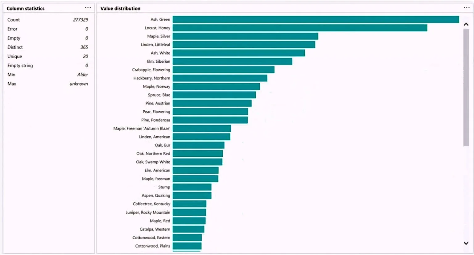
Use the drop-down menus to select the answer choice that completes each statement based on the information presented in the graphic.
- The number of distinct values is: [Option]
- The number of unique values is: [Option]
Question 50:
Note: This question is part of a series… You have a clustered bar chart that contains a measure named Salary as the value and a field named Employee as the axis. You need to create a reference line to show which employees are above the median salary.
Solution: You create a percentile line by using the Salary measure and set the percentile to 50%.
Does this meet the goal?
- A. Yes
- B. No
Ready for Offline Study?
Get the complete PL-300 question bank with detailed answers as a downloadable PDF to supercharge your exam prep.
Download Complete PDFFrequently Asked Questions (FAQ) about the PL-300 Exam
1. What types of questions are on the PL-300 exam?
The PL-300 exam includes a variety of question types, such as multiple-choice, drag-and-drop, hotspot questions where you select an area of an image, and scenario-based case studies that test your ability to apply knowledge in a real-world context.
2. How much time do you have to complete the PL-300 exam?
You will have 100 minutes to complete the exam, which typically consists of 40-60 questions. It’s important to manage your time effectively, especially on the longer case study questions.
3. What is the best way to prepare for Power BI visual interaction questions?
Hands-on practice is key. Create a Power BI report with multiple visuals (slicers, charts, tables) and practice using the “Edit interactions” feature in the Format tab to control how they filter and highlight each other. Understanding the difference between Filter, Highlight, and None is crucial.